Connstellation
Clients:
The 601W Companies
Cushman & Wakefield
Work Performed:
- Art Direction
- Brand positioning
- Collateral design
- Copywriting
- Naming
- Research
- Visual identity
- Verbal identity
Photography by David Madison


Clients:
The 601W Companies
Cushman & Wakefield
Work Performed:
Photography by David Madison
Connstellation is a 660,000 sq. ft. complex for education and work, located at 4000 Connecticut Avenue in Washington, D.C.
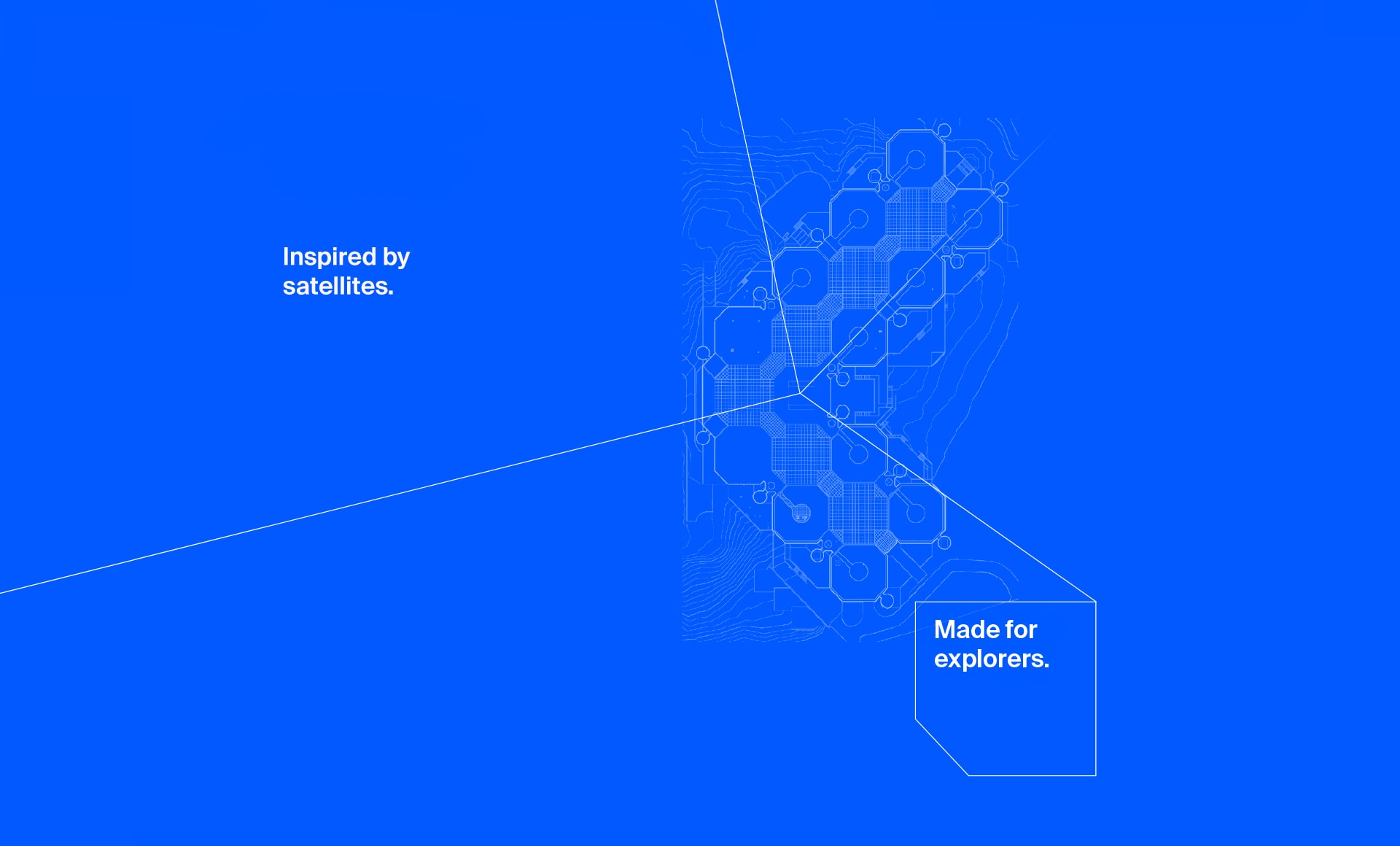
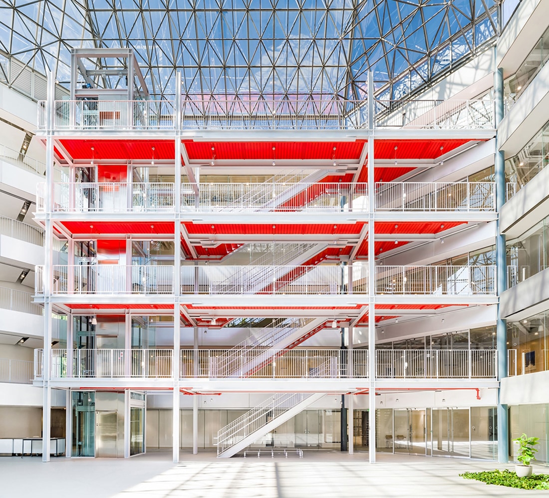
Originally built in the 1980s for INTELSAT, the world’s first commercial satellite company, this massive building is comprised of 14 pods and is set on 13 acres of parkland. Architect John Andrews, drawing on lessons from residential architecture in the warm Australian climate, designed Washington, D.C.'s first "green" building, which naturally cooled and heated itself. The building was reimagined for a contemporary context when it was redesigned by Renzo Piano for the Whittle School in 2020.
In 2022, the school was forced to close, leaving the building mired in legal complications, necessitating a significant re-positioning in the market.
I was hired by 601W Companies and Cushman & Wakefield to renew the brand perception of the building complex within the brokerage community, the media, and the minds of prospective tenants.
Capture the imagination of educational institutions by positioning the building as the very best campus environment in all of Washington DC.
Rename the building in order to distance it from the troubled Whittle School and its preceding identity as solely an office building.
Create a brand that appeals broadly and does not alienate potential corporate tenants.
Craft a humanizing story that explains the complexities, opportunities, and the enormity of the property.

To begin crafting a brand narrative for Connstellation, I decided to emphasize the building's distinctive history and architecture. I started with its history as the headquarters of INTELSAT, the company behind the world’s first commercial satellites. INTELSAT's storied past includes televising the moon landing and making long-distance telephone calls accessible to all Americans. Despite being built in 1982, the building's architecture remained decidedly futuristic, bright, and optimistic. As recently as 2018, The Washington Post described it as a “Skylab brought to Earth.”

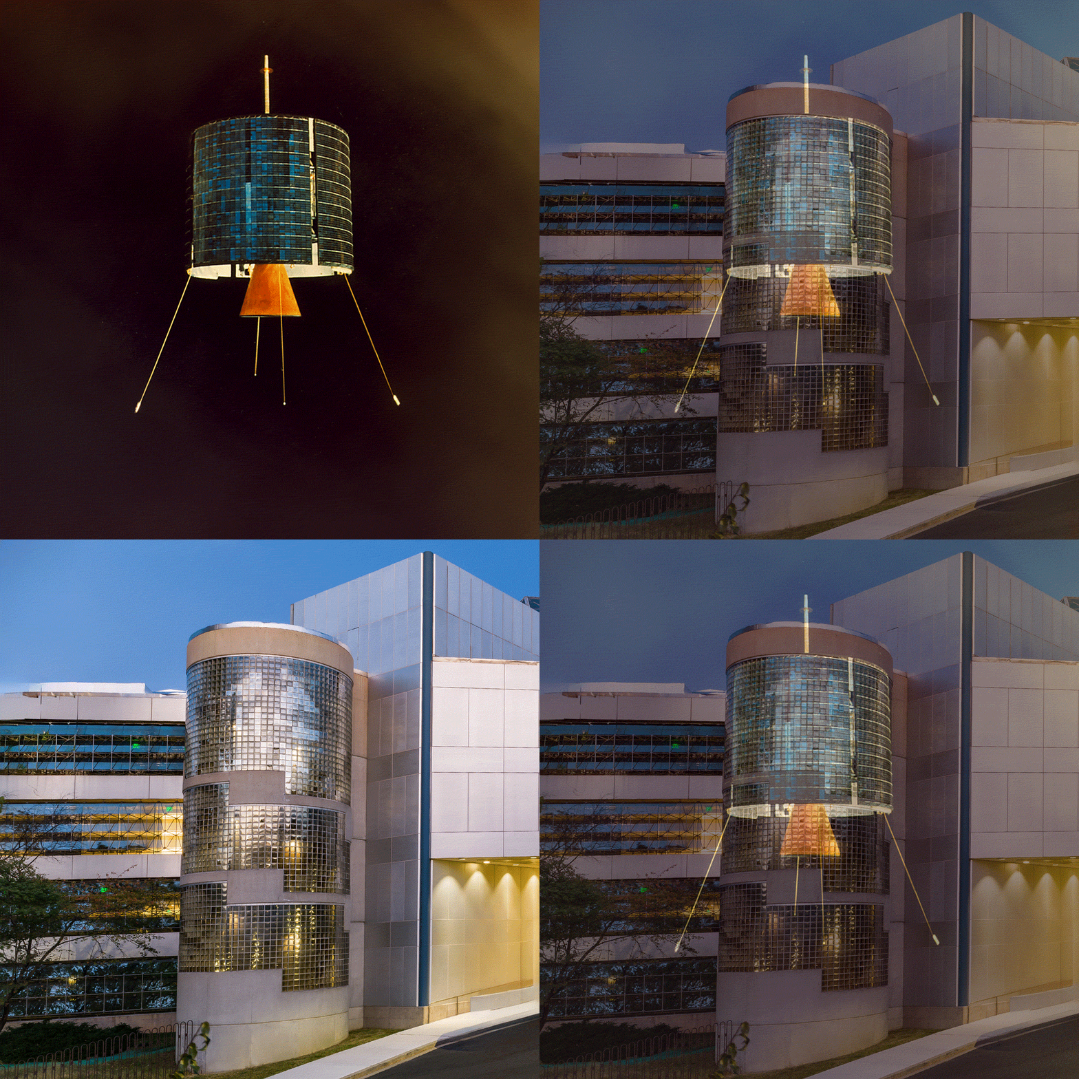


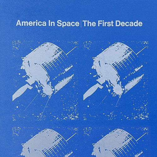
By integrating space exploration and a NASA-inspired design language, I aimed to honor the building's history while creating a forward-looking identity for the school. Connecting space exploration with learning, I envisioned the building as a space station of exploration. With its brilliant space-age architecture, I saw Connstellation as a place where schools can engage young minds and empower them to embark on their own voyages of discovery.

The logo icon is inspired by the building’s architectural features of connectivity and shared commons. At first glance, the design appears simple, but it contains multiple visual references. Tied directly to the brand’s name, the graphic echoes the letter "C" while also referencing the point-to-point line art used to depict constellations.
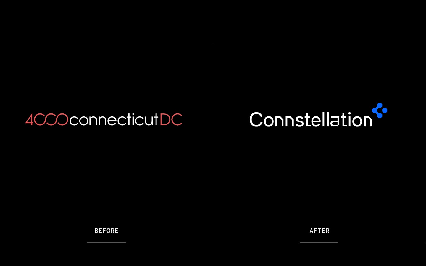
The previous name "4000 Connecticut DC" was wholly based on the building's street address; and while it was determined that re-naming the building was necessary to reposition the building, we didn't want to lose the name recognition of the address entirely.
After an accelerated naming process, "Connstellation" was chosen, with the intentional spelling with two N’s as a nod to its address. As a strategic benefit, the unique spelling also made it easier to trademark the name.

In order to envision Connstellation as a place where institutions could bring their aspirations to fruition, I undertook a significant effort to understand how schools were talking about themselves and what their public concerns were. This involved researching how schools described their mission and how they communicated their values both internally and externally. I examined the social media of principals and school CEOs, reviewed educational conference materials, and read articles where teachers discussed their day-to-day experiences.
I discovered an epidemic of disengagement among students and teachers in virtually every school in America—and, for that matter, in every workplace. Schools aimed to empower their students to succeed and reach their full potential, while also striving to empower their teachers to advance the school’s vision and feel valued amid rising levels of burnout and resignation.
Through this research, I curated a vocabulary that resonated with schools as they articulated their vision to parents, students, governments, employees, and teachers. We utilized this vocabulary to craft a rallying cry that would mirror their vision back to them: Engage. Empower. Explore.

To humanize this massive complex, I approached the building as a set of solutions for the most pressing issues faced by schools. The ability to customize a wide range of learning experiences for students has become a driving force in the renovation and development of educational facilities. Connstellation emerged as a turn-key solution, offering the most advanced infrastructure available to meet both technological and operational needs.
John Andrews’ original architectural genius, positioning the building on the slope of the landscape and his strategic placement of windows, provided the most coveted features of all: natural light everywhere and natural means of ventilation. These features contribute to optimal physical and mental health outcomes for both students and staff, which are the absolute top priorities of any school today.

Echoing NASA's historical use of Helvetica while offering a more contemporary and softer appearance, I chose Suisse International as the primary typeface. The color scheme was inspired by blueprint schematics and NASA's print materials from the 1960's.

To create more dynamism and a sense of motion in the designs, I created a satellite trajectory design element. The element also emphasized the ideas of navigation and voyages of discovery.

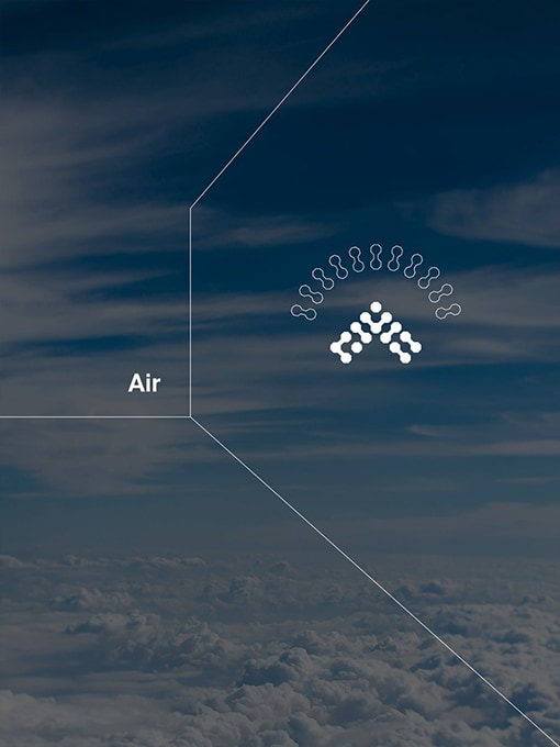
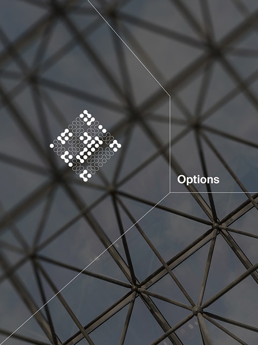
Eschewing traditional icons, I designed a system of pictograms to provide greater flexibility in depicting more abstracted concepts, beyond simple building features.
I extended and augmented the hexagonal shape of the logo to reinforce brand cohesion and visual harmony, while also creating a direct association with the building's architecture.

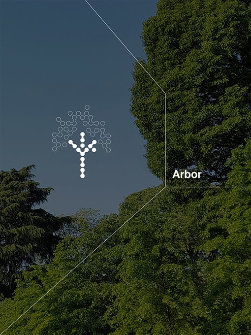

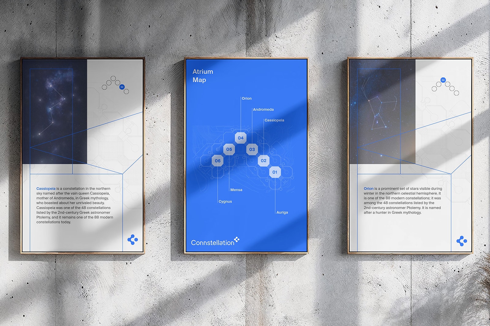
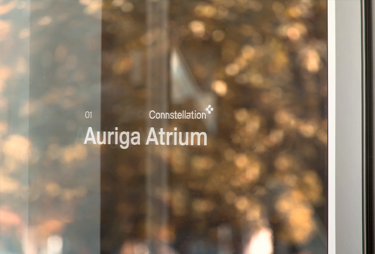
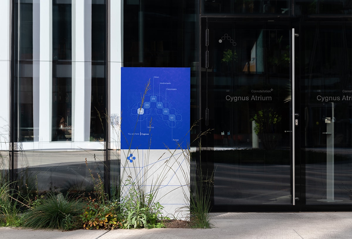
Connstellation features six atriums as shared commons. Seizing the opportunity to enhance storytelling and reinforce the brand, I named each atrium after a constellation. This not only eases navigation but also connects people to the broader theme of exploration and discovery. By making the environment more memorable and engaging, it became a way to strengthen both wayfinding and place branding.
